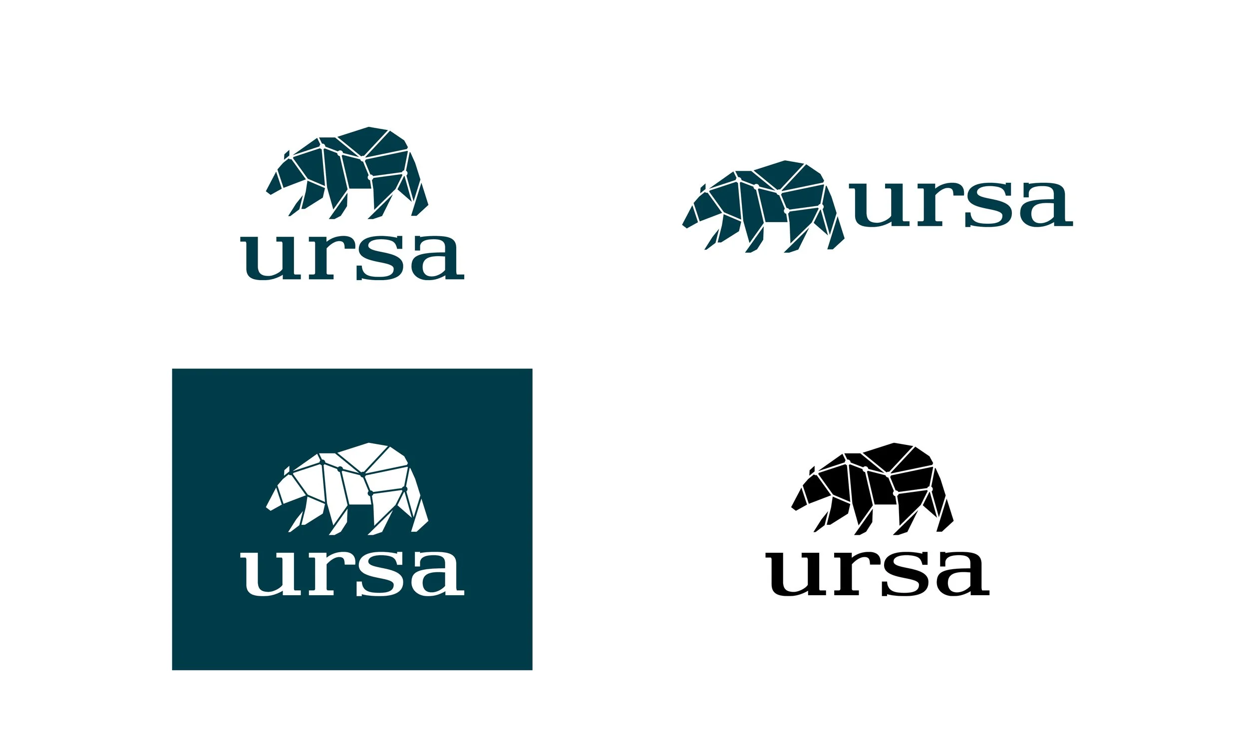
ursa
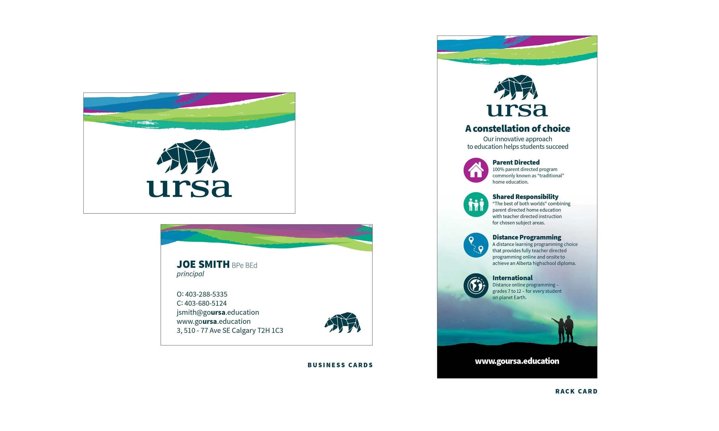
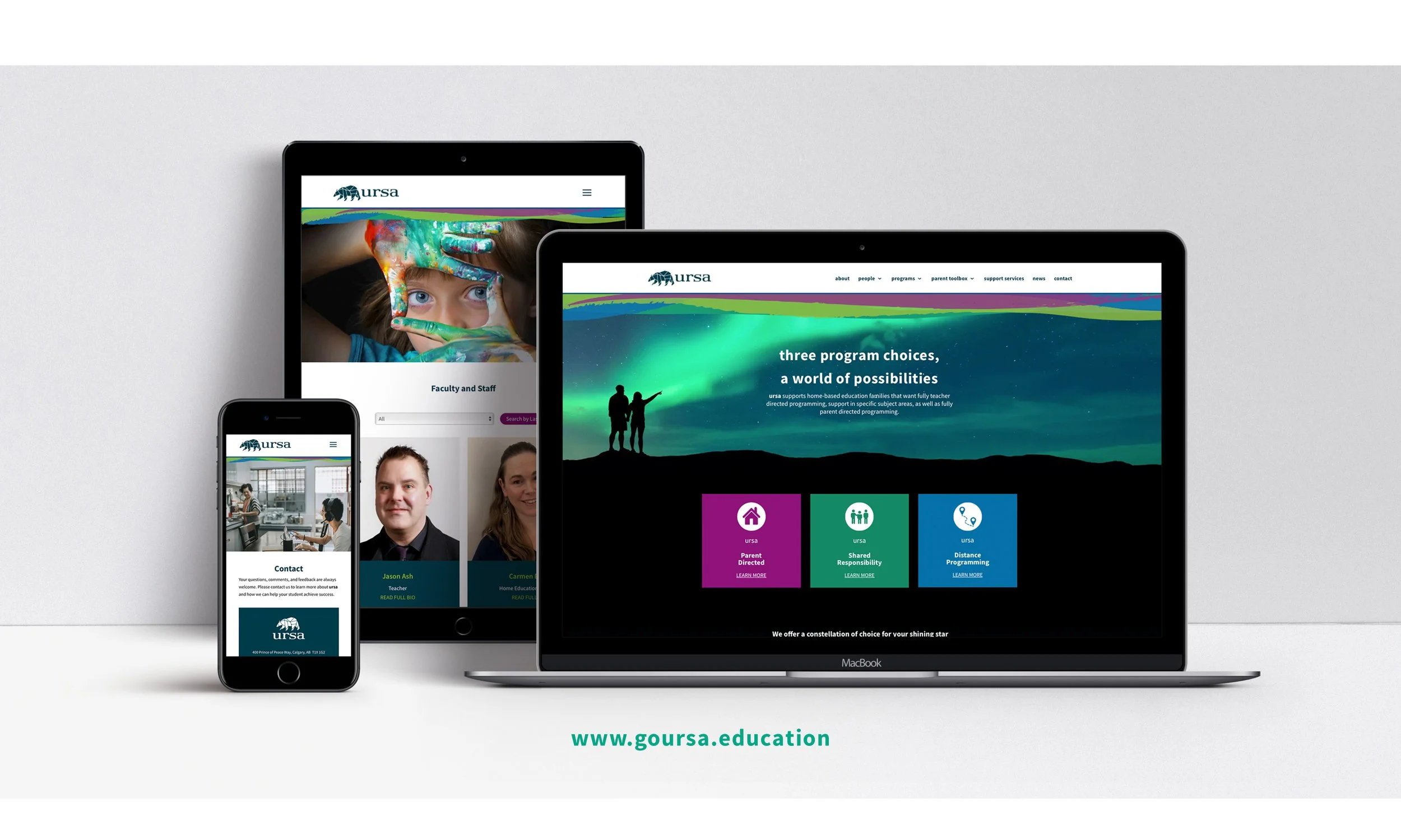
This client came looking to brand their unique online learning programs as a school that reaches an international audience, feels Canadian to showcase a high standard of education, and is a place where children of all ages can support and represent their school with honour.
2021 Gold Summit Creative Award for Logo Design
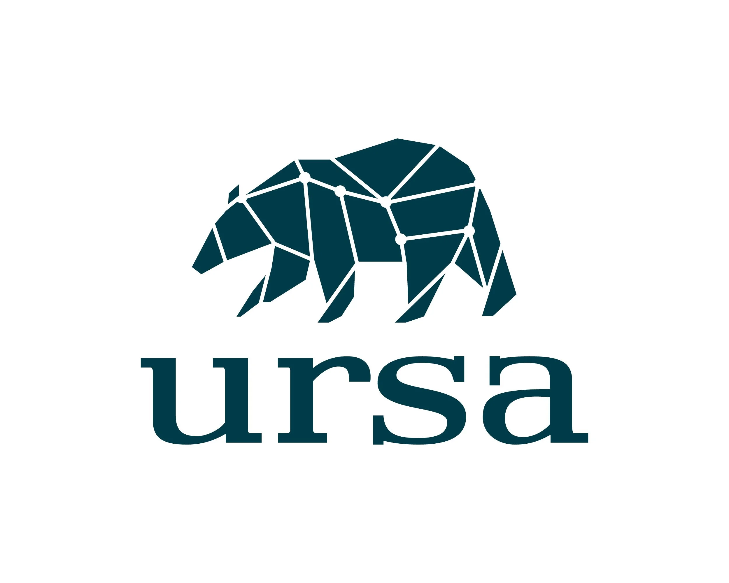
The ursa logo needed to showcase what ursa means - a mother bear, independent, fierce, and nurturing - all qualities an independent learning student must embody.
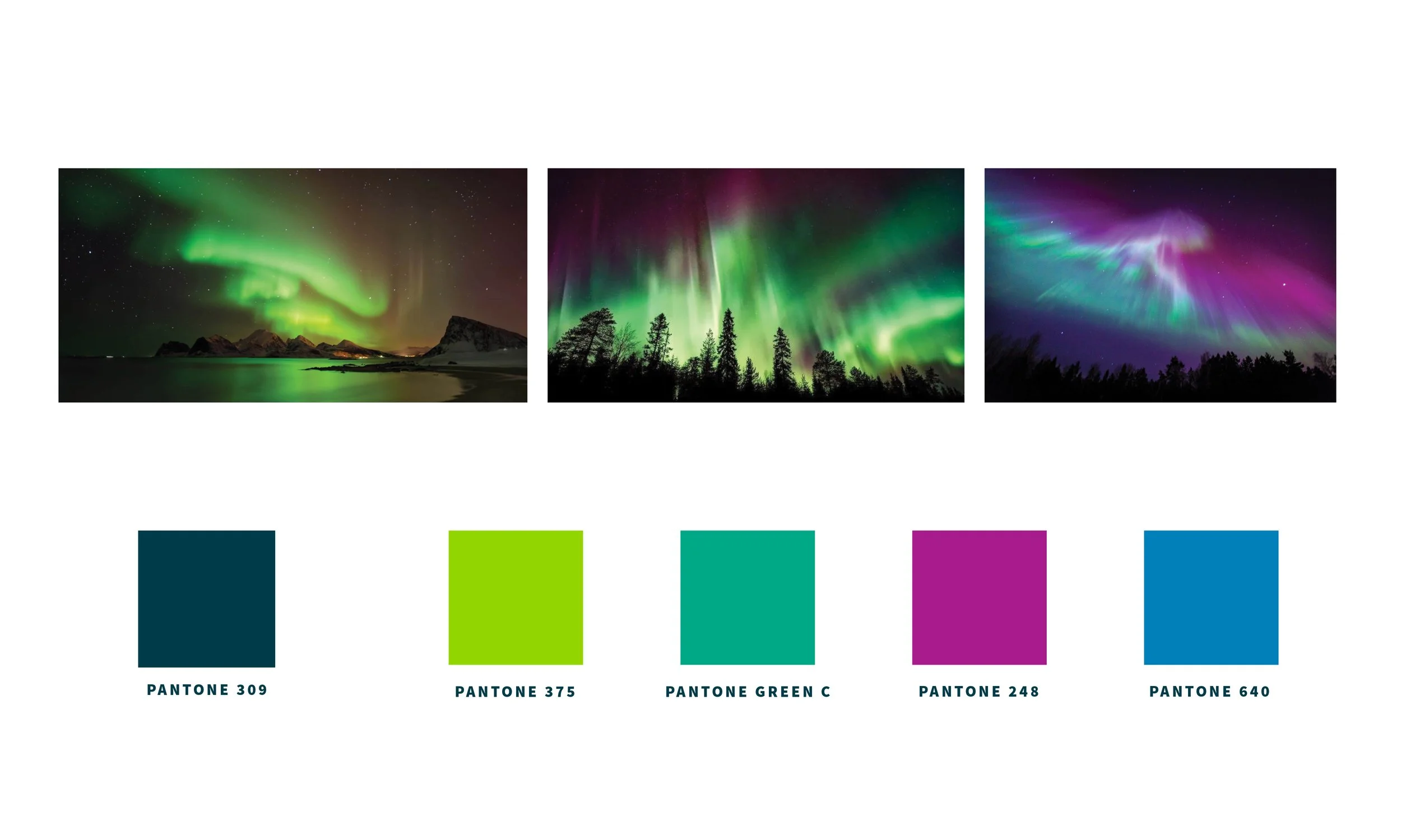
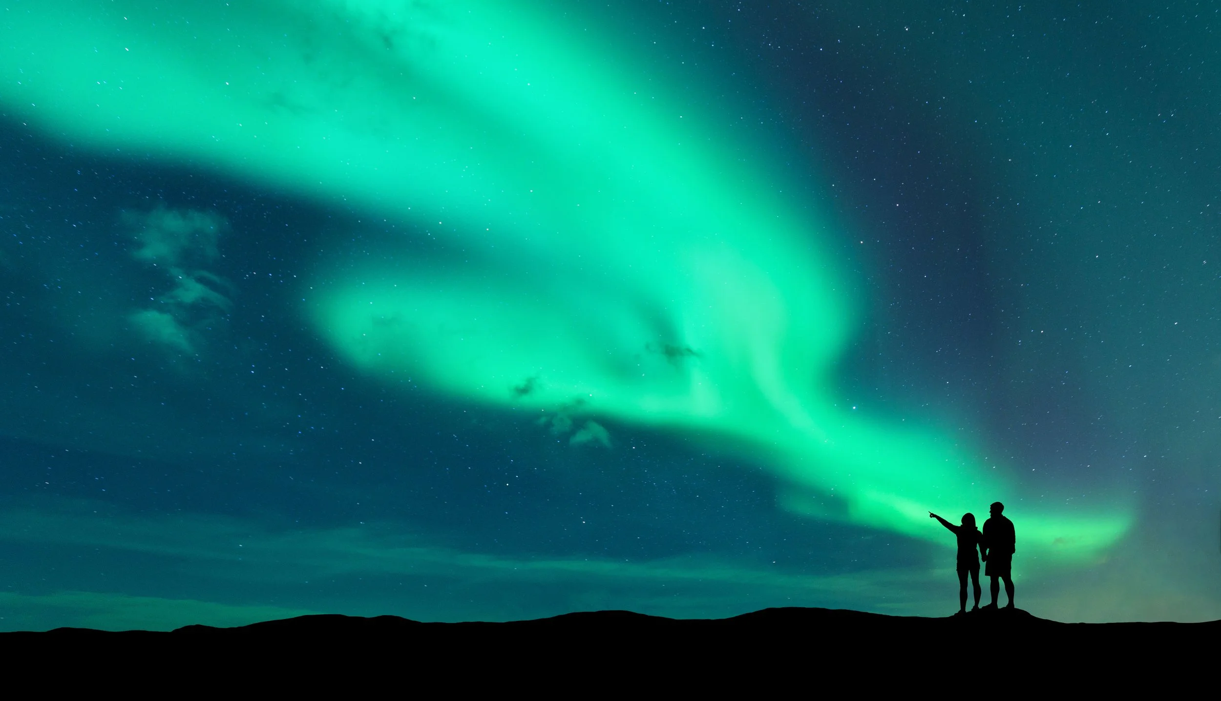
We took inspiration from the third largest constellation, Ursa Major, or the big dipper, which is one of the most visible in the northern hemisphere. Within the connections of the bear you’ll find Ursa Major’s stars, like students learning apart from each other by distance, together they form a greater community.
Finally, this mother bear needed to feel like ursa’s home base in Western Canada, so the black bear was chosen with its identifiable delicate limbs and long snout. The connections between the angles of the bear’s body are used to create action, movement, and division of body parts using a single colour.